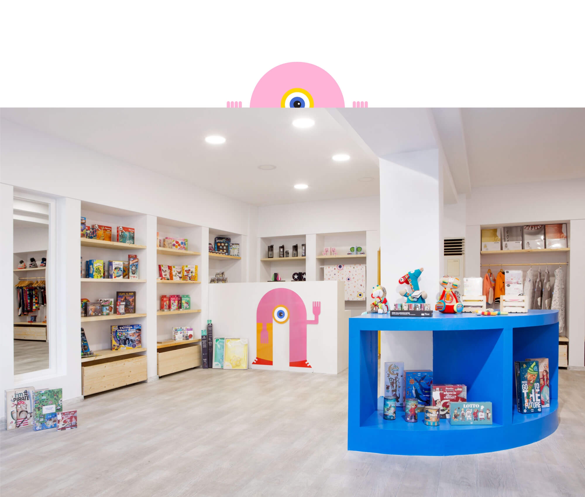
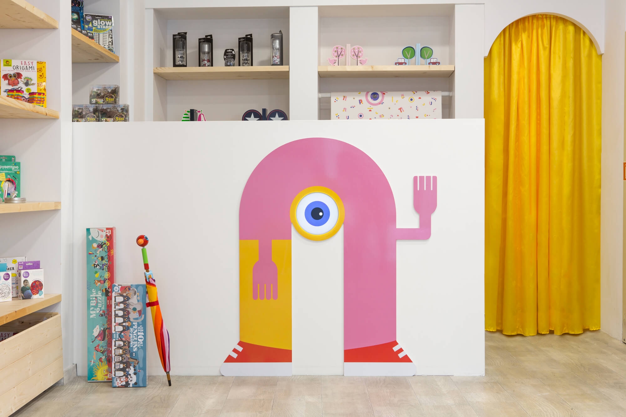
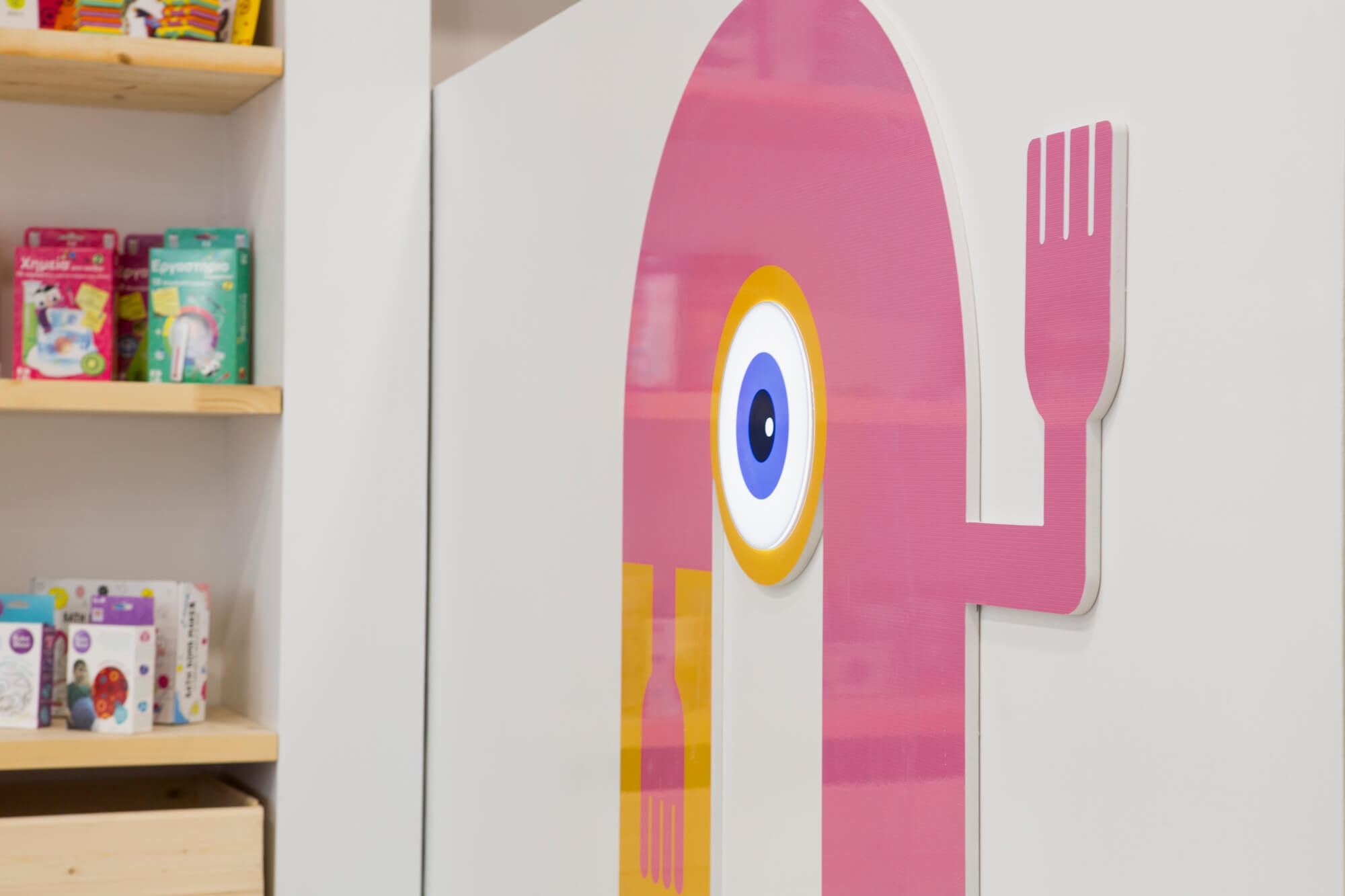
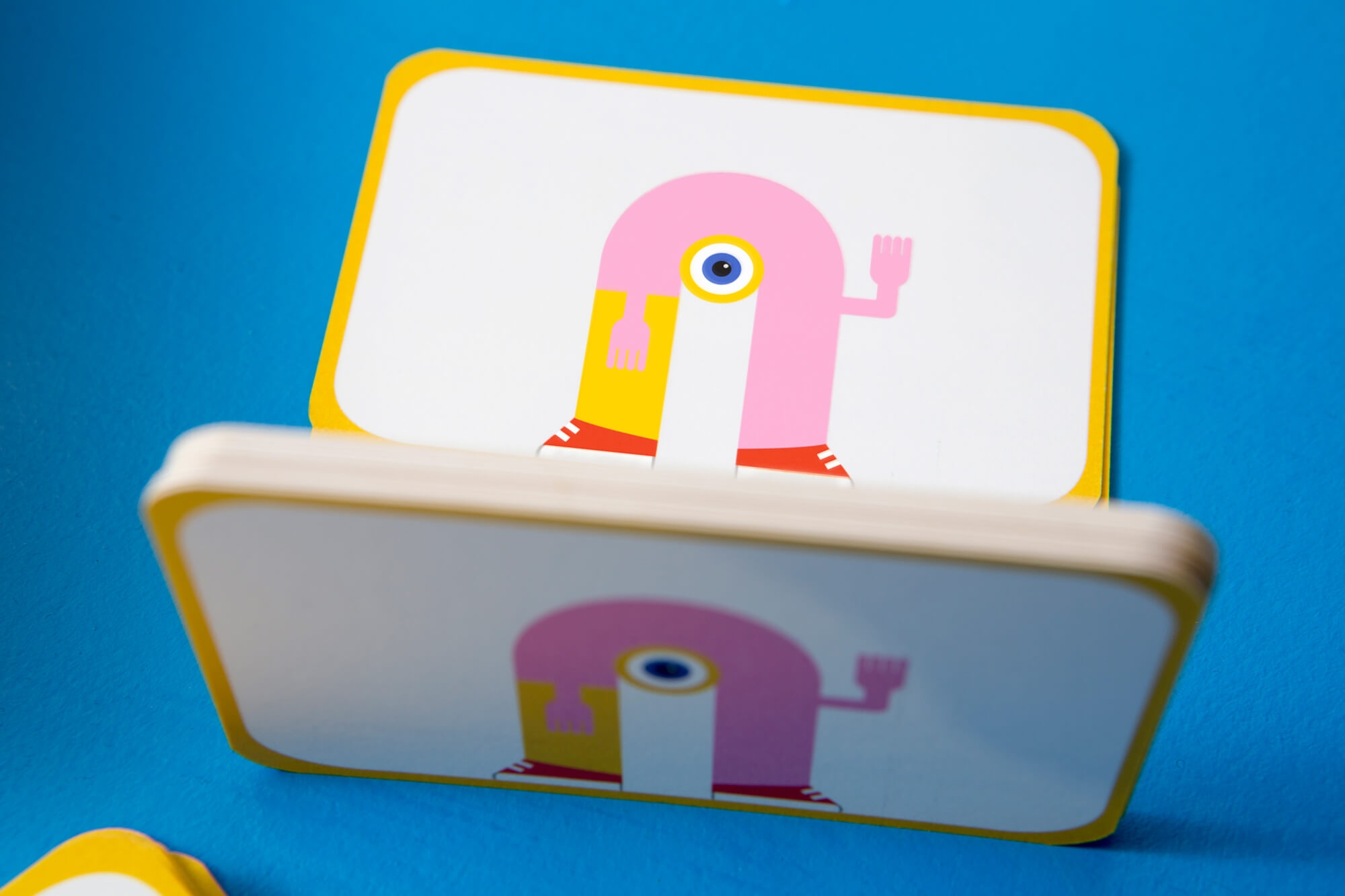
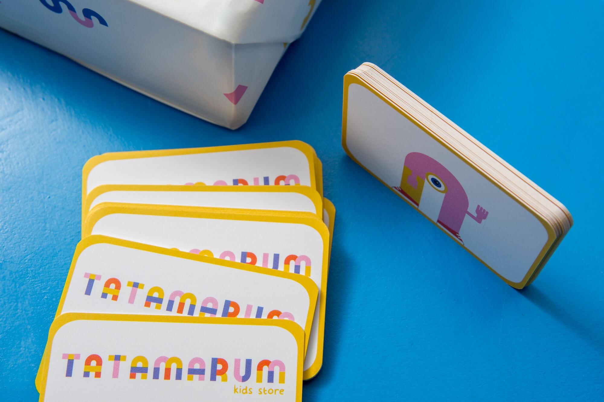
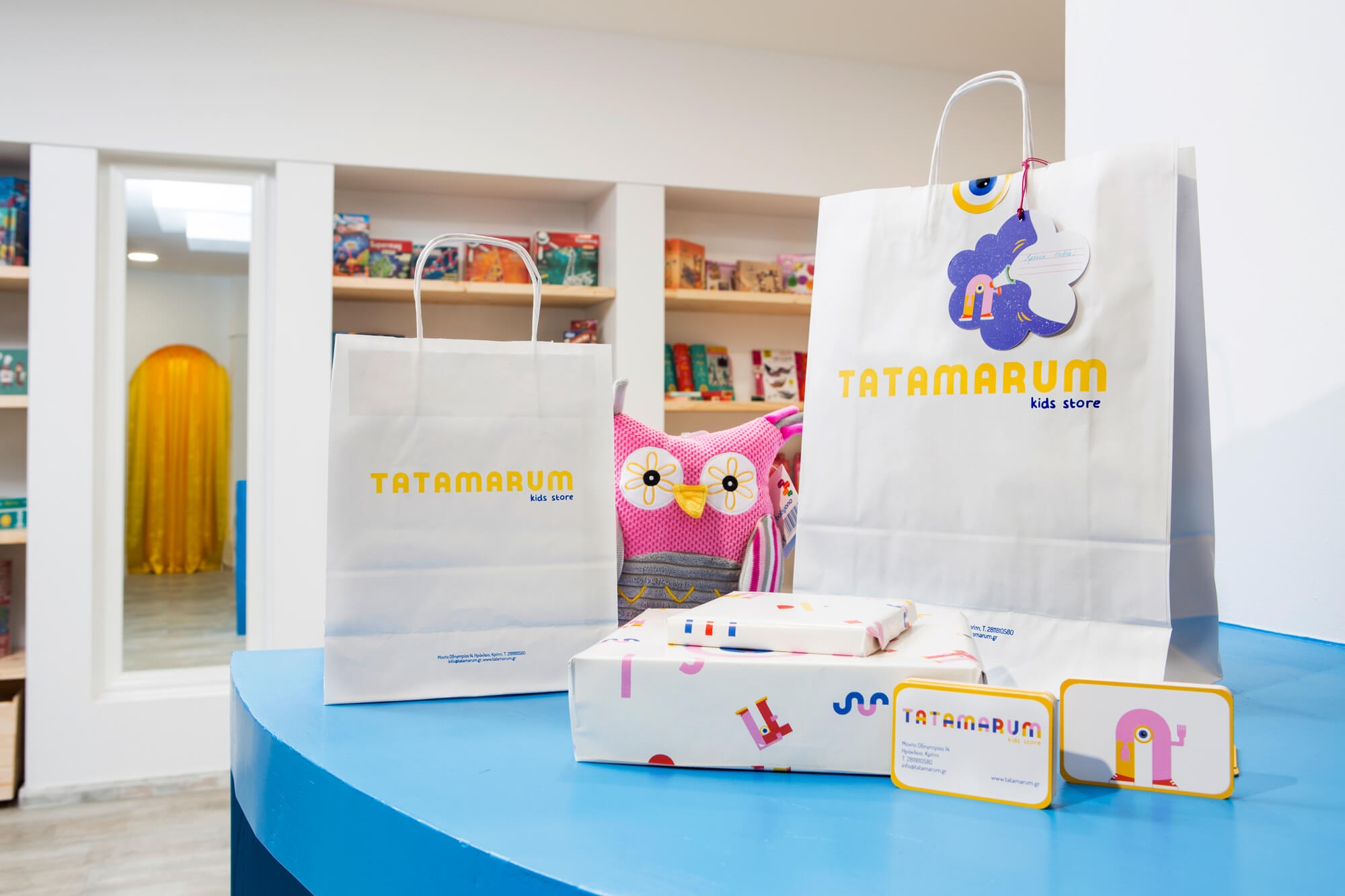
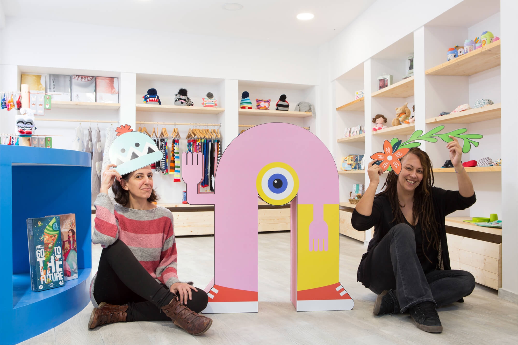
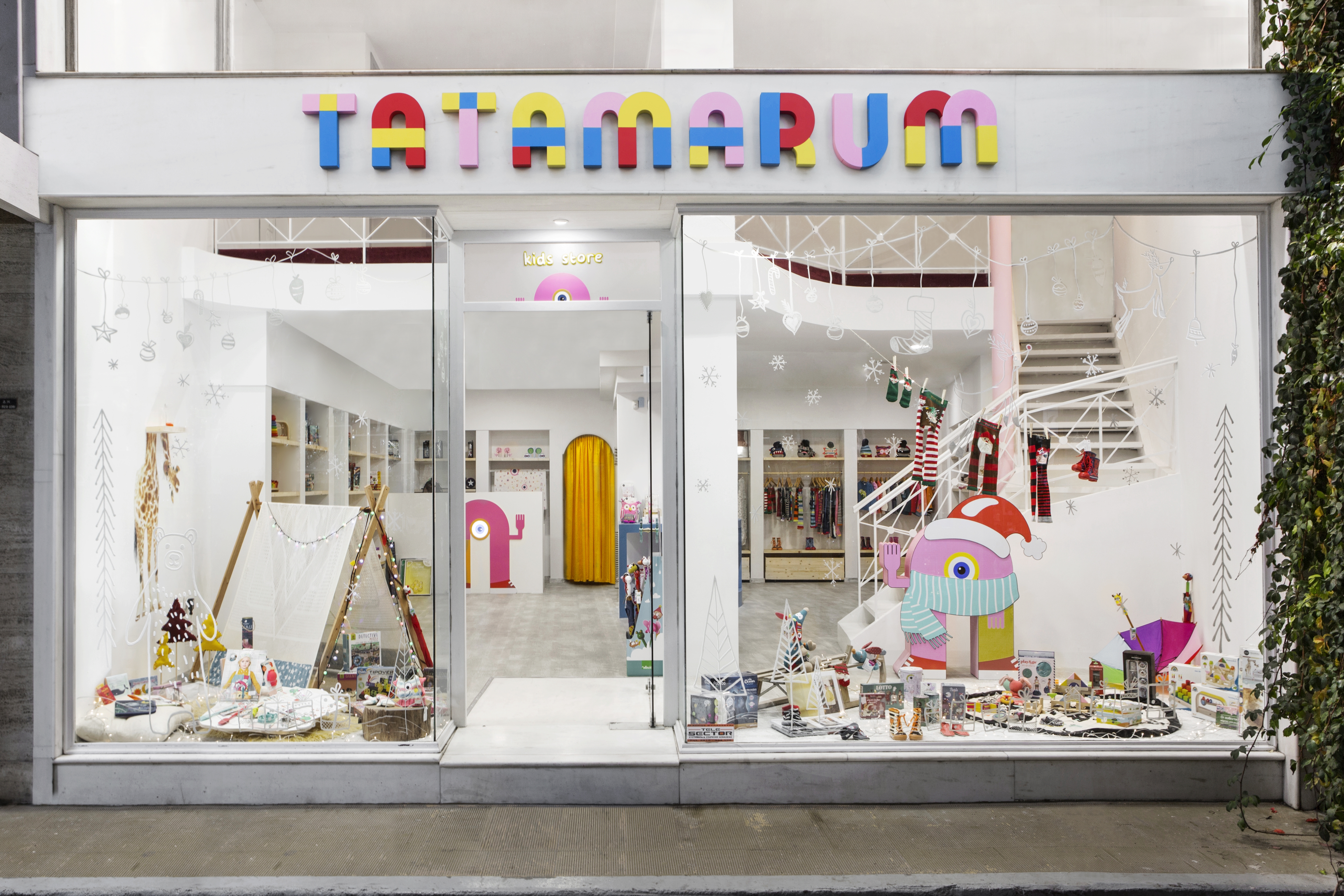
Tatiana and Maria decided to open a unique store for children. The choice of the name TATAMARUM came from the combination of their names. The basic concept in brand design was to create a playful logo that appears to be assembled using colored pieces. By extracting the letter A from the logo, we have developed a character with plasticity and movement. The mascot complements the logo and, through its flexibility and dynamic nature, undergoes seasonal transformations to meet the brand's communication requirements. The logo was designed with vibrantcolors and strong typography. The vibrant color palette used in the logo and the mascot was developed and adapted for various applications.We developed the comprehensive visual identity for the company, encompassing digital and print applications.
Logotype | Identity | Brand strategy | Signage